The Big Question
An enterprise B2B business engaged a Portland agency in the redesign of their corporate website and community forum. General look and feel was locked in via a set of proof-of-concepts embraced by the client.
As the UX architect on the project, how could I ensure that our wireframes – and the UI design that followed – kept to the spirit of the client’s expectations while meeting the needs of the business and its customers?
Context
Starting with the Sitemap
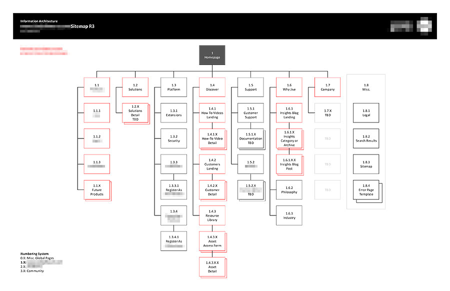
The website’s proposed content hierarchy (as reflected in the sitemap) had undergone significant revisions and evolutions away from what was then present on the live site. Those conversations continued well into the agency’s engagement with the client. It became clear that the sitemap and overall content strategy of the component pages was something that would impact the UX and design deliverables and, as such, was an aspect of the project that our team could help bring some clarity on for the client.
In addition to the general stakeholder and SME research interviews done in the early phase of the engagement, we also began to help clarify and guide the sitemap conversations. In doing so, we created a content inventory spreadsheet (Figure 2), that acted as the single point of data collection and definition of such things as individual page business goals, KPIs and analytics, common templates, and assorted page-specific notes.
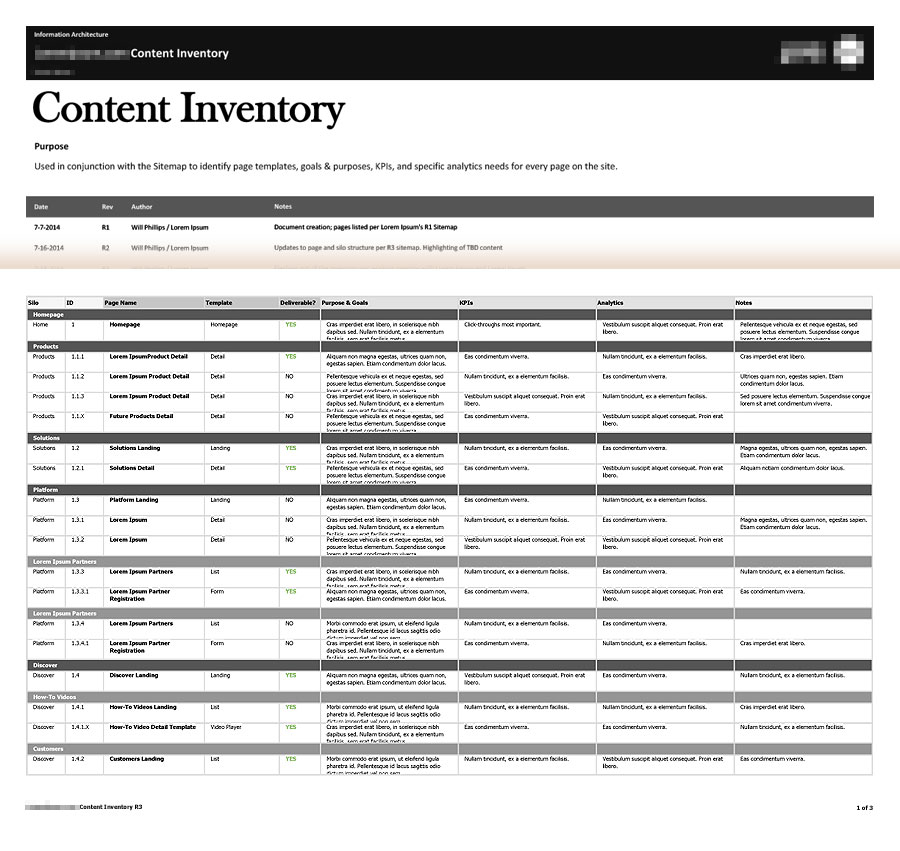
The content inventory was important as it became very clear early on that eighteen wireframes and a lesser number of full UI comps wouldn’t come anywhere near to covering the full scope of the website redesign. We used our working meetings and content inventory to identify which set of pages would deliver the most value for the client’s internal development team to use as references and templates for other pages not being delivered by the agency.
All that work proved to be valuable, as it funneled a series of disjointed conversations and two steps forward, one step backwards style evolutions to the website’s content into a single document and point of reference that was needed to identify exactly what each content silo and individual page should accomplish, and how it would be measured in regards to meeting those goals.
Wireframes and UI Module Library
Preliminary wireframe work began on the most high-profile sets of pages (e.g. homepage, certain Tier 1 pages) while the finer details of the rest of the sitemap and content inventory were being finalized. The client had a set of proof-of-concept UI comps they wanted us to key off of, so certain layout decisions were sacrosanct. Other than that, we were given flexibility in our layouts, and I continued to work iteratively with the digital director and client team to create a set of templates that could be applied to series of pages (as specified in the content inventory spreadsheet).
Due to the tight time limitations on the project, the wireframes were designed directly in Photoshop (and presented to the client as an annotated PDF) so that the native files could be used immediately by the visual designers on the project in order to facilitate a faster turnaround time.
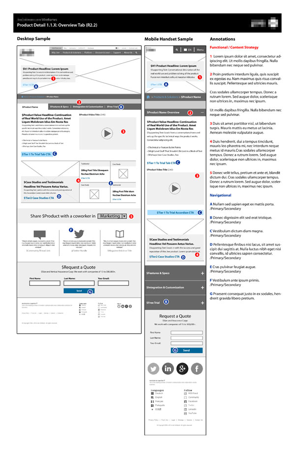
Ultimately, I was responsible for the identification and creation of a set of five page templates (the home page plus four page templates) that were then used to build out fifteen different individual page wireframes, An example of one is seen in Figure 3. Additionally, we broke up the individual modules into their own standalone wireframes as a PDF module library (not seen) that could be referenced as common building blocks for building new templates or unique pages in the future.
Outcomes
When the schedule is tight, there is always the temptation to rush through or forgo some of the behind-the-scenes elements of a project, but this goes to show that research and information architecture work up front is a real value add to the long-term sustainability of large projects, such as this enterprise B2B website.
This project was being run on a very tight timetable with a set of deliverables already defined in the statement of work. As such, it could have been easy to dive right in and start sketching and creating a whole host of page-specific wireframes based solely on what the client had expressed before the real depth and scope of the project was uncovered.
Yet, as the engagement moved forward, it became clear that our team would do best by the client in first helping them understand the structure and goals of their website redesign. We could then be comfortable in creating a set of page templates and UI comps, page-specific wireframes, and component module library. This way, the work done by their internal team on content not covered by the agency’s design deliverables would be guided by the overall content inventory document that was created and maintain clear structural and visual consistency with the other sections of the our work covered.